Thursday, February 18, 2016

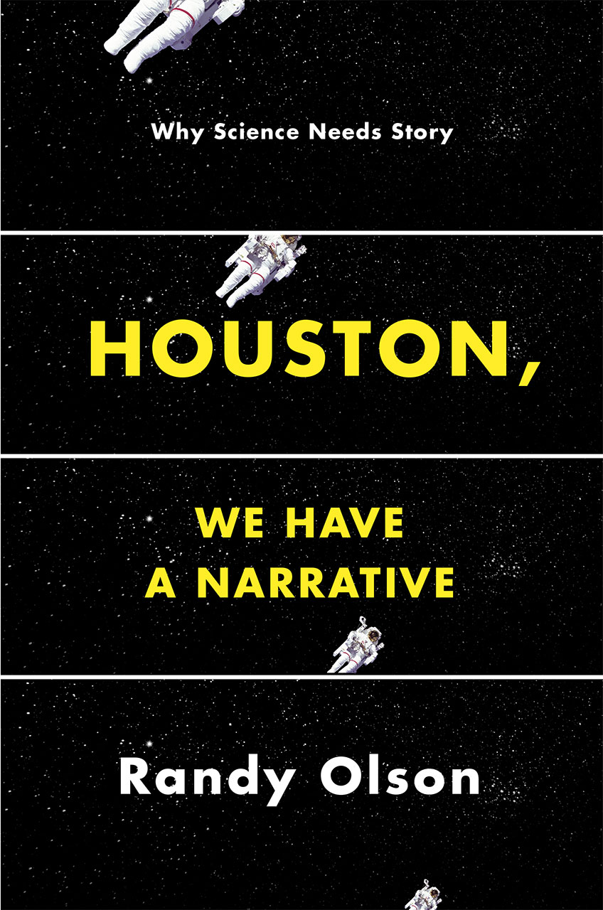
Randy Olson's "Houston, We Have a Narrative: Why Science Needs Story," Part 3: Synthesis


Part 3 of Randy Olson's Houston, We Have a Narrative: Why Science Needs Story is not the longest part of the book, but it's the most difficult to summarize. Part 2, while much longer, concentrated on three methods for making research into story. This chapter is more disjointed and goes in a few different directions.

What does "story" mean?

Olson begins by defining the term he used throughout the entire book: story.
I define "a narrative" or "a story" as "a series of events that happen along the way in the search for a solution to a problem."
This then means a "storyteller" is just someone who recounts the series of events that happened along the way in the search for a solution to a problem. 

Why are scientists so hesitant or afraid to use stories? Because they think they are untruths. But with Olson's definition, they aren't. They're just retelling events. But it isn't just a list of facts. That's not a story. It is only, well, a list of facts. The AAA (and, and, and) method is not actually a story because there is no problem.

McKee's Triangle

Olson relates this to Robert McKee's Triangle of archplot, miniplot, and antiplot. Antiplot is the stuff where nothing happens. There's not even a narrative.

In a miniplot, nothing much happens, but there's always good acting and character development. Archplot is the stuff Olson has been talking about. There's a real problem with a protagonist and antagonist, and the protagonist has to save the day. And everything's pretty linear.

Archplot is the ABT method (that's and, but, therefore for those that don't remember from last time). But archplot must have a positive result. The research proved that something is true. Miniplot is the stuff of null results. Not much happens, but you have to know the information anyway. And the AAA method of listing facts is the antiplot. Nothing happens. At all. It just keeps going with a bunch of images.

The Global Warming Miniplot

This archplot, miniplot, and antiplot metaphor explains why global warming has such problems. There's not a clear cause. Events in the weather patterns appear random. There isn't a single protagonist or antagonist. But most importantly, there isn't a closed ending. Do we try to stop it or is it too late, but we should mitigate it, or do we have to try to learn to live with it?

For Olson, global warming is a "miniplot mess." Just like Al Gore's An Inconvenient Truth. An important movie, certainly, but not something that we return to again and again. It's just not that exciting.

But imagine this:

Once upon a time on a small blue plant there was an atmospheric crisis that threatened all of humanity [ozone hole] AND by the early 1980s the problem seemed dire, BUT then the nations of the world came together and passed a treaty, THEREFORE today that problem is set to go away...

BUT THEN a second atmospheric problem emerged in the late 1980s (global warming) and those same nations that solved the ozone problem have been unable to solve this problem. WHY IS THAT?

And then it goes into its plot. Why haven't the countries of the world been able to solve this problem? That would be an archplot.

Conclusion: Buy this book

Olson wants scientists to form groups to tell their stories so that they can build their narrative intuition. It's a good goal, but it's hard to do. Trust me. I've tried.

But Olson's book is a good start. It has definitely made me want to continue reading about stories. I think I need to read Olson again, though.

This really is a book that can be returned to again and again. Not only to learn but to enjoy. The writing here is better than in Don't Be SUCH a Scientist, and the stories may be more fun.

Remember: if there is a book that you would like for us to summarize, send us a note.

Monday, February 15, 2016

Randy Olson's "Houston, We Have a Narrative: Why Science Needs Story," Part 2: Antithesis


The main, long part of Randy Olson's Houston, We Have a Narrative: Why Science Needs Story is the second part, "Antithesis." In the first part, he goes into detail about the power of story and why science should learn how to make its work relevant and exciting by learning how to craft stories. In this second part, he shows how to do that.

He has broken his forms into what he calls the WSP model, or word, sentence, and paragraph.

The word template, or Dobzhansky template

When you want to boil down your main idea, turn to the Dobzhansky Template, named after a famous Russian American geneticist who said, "Nothing in biology makes sense except in the light of evolution."

That's the essence of narrative right there. Just fill in the blanks: "Nothing in ________ makes sense except in the light of ________." Without that narrative that makes sense of the big picture, all you have are a list of facts, and nobody likes those.

Try to boil your work down to one sentence, to the main theme. What exactly are you trying to say? To get at? Why should we care about this aspect of science that you study? Because nothing in the bigger picture makes sense without it.

The sentence template: and, but, therefore

I already mentioned the and, but, therefore (ABT) template in my last post, and most of this second part is devoted to this form. Olson calls it the "Universal Narrative Template." The "Nothing in ________ makes sense except in light of ______________" is the main theme of your work, but the ABT template is how you should really try to communicate it.

Scientists often get stuck in the and part, though. They just want to say, "and...and...and...and....and," which is what Olson calls the AAA structure. They never make it to the "but," which is really the problem that they're trying to solve. That's the conflict. Without the "but," we don't care about what you have to say. Without the "but," there really is no story. It's just blah, blah, blah.

It is the "but" that allows us to see the "therefore."

But then there are some who get bogged down in the "buts." They give us three or four or five problems instead of just one! This is the despite, however, yet (DHY) problem. The AAA bores us, but the DHY confuses us. Neither one allows us to follow the exact story. It's best to figure out the Dobzhansky Template and work from there.

Here was a wordy draft of the ABT template from Katelynn Faulk:
In my lab we model moderate sleep apnea in rats with a chronic intermittent hypoxia protocol in order to investigate the physiological mechanisms of sustained diurnal blood pressure, BUT we have realized the importance of molecular pathways within the central nervous system contributing towards blood pressure control, THERFORE we have begun exploring novel molecular pathways that develop as a result of our sleep apnea model.

She eventually drilled down to the core:
We were looking one way but realized there's another way therefore we're looking at that way.

Which allowed her to revise to something optimal:
I my lab we're studying sleep apnea using rats as our model system, AND we've been focused on physiological mechanisms, BUT lately we've realized the real controls may lie at the molecular level in the central nervous system, so AS A RESULT we've begun exploring novel molecular pathways. 

That's the kind of revising we should all do.

The paragraph method: developing narrative intuition

This part is the hardcore part in story developing following Joseph Campbell's hero's journey. Olson gives us his "Logline Maker" to help:
  1. In an ordinary world
  2. A flawed protagonist
  3. Has a catalytic event that upends his/her world
  4. After taking stock
  5. The protagonist commits to action
  6. But when the stakes get raised
  7. The protagonist must learn the lesson
  8. In order to stop the antagonist 
  9. To achieve his/her goal

It works!

To show us how well it all works, Olson goes through several actual abstracts and explains how they use the ABT template. Then he goes through James Watson's The Double Helix and shows how Watson uses the entire hero's journey. It's fascinating, and it shows the power of narrative, even in science.


Thursday, February 11, 2016

Randy Olson's "Houston, We Have a Narrative: Why Science Needs Story," Part 1: Thesis


Randy Olson wants scientists to learn narrative but they have a tendency to want things to be complicated. Scientists love complexity, it's true, but narrative is about simplicity, not complexity.

"It's all the same story."

Olson insists that science and story follow the same structure. In fact, he says, "Dude, it's all the same story." Meaning ALL. Everything. De todo.

Part of the problem with scientists is that they want to jump straight to the numbers, to the data. But we as the audience or readers, we want to care. We want to be moved. And numbers don't do that. Stories do.

The public gets bored with numbers alone. They want specifics. They don't want a jumble of facts, they want a story that moves them.

And stories have problems. People want solutions to problems, but they need real motivation, a reason to listen in the first place. Without a central problem, there's no need to listen. Scientists sometimes have trouble defining the problems that they're trying to solve.

No, really, it's all the same story

One of the central themes of part 1: Thesis is that all stories are basically the same. Whether it's science's introduction (why), methodology (how), results (what), and discussion (so what?) (IMRAD) or a standard piece of narrative literature like a novel, they all pretty much the same.

Olson uses Joseph Campbell's 1949 work The Hero with a Thousand Faces to prove his point that narrative is all narrative; there's a common thread through all of it.

Part of what people expect from story or narrative is specifics. Olson says, "If I tell you the story of one little girl in Africa who is going to die next year from a disease, you are going to get upset by exactly X number of 'units of upset.' But if I tell you the story of two little girsl in Africa who will die from the disease next year, wouldn't you get twice as upset?"

But that's not how it works. Instead, "the death of one individual is a tragedy, the death of a million is a statistic." Too bad, but that's the way it works. Stories need specifics to be moving, to be powerful, to truly communicate.

Enter the humanities

Scientists don't take humanities courses, though. Well, most schools require a few general education humanities courses, but scientists in general don't like to take them. They seem like a waste of time. So scientists haven't internalized narrative. They haven't learned narrative intuition.

So the humanities should be there to rescue scientists. After all, they're both on the college campus, so they should help one another.

But nope, the humanities are just a bunch of academic eggheads:

I'm afraid they're a bit of a write-off for the sciences when it comes to addressing this serious, and I think urgent, problem of narrative deficiency. Scientists need help, but they must get it from people who go beyond theorizing and work in the real world.

Hollywood to the rescue!


So what scientists need is Hollywood. Hollywood is cutthroat. If you can't cut it, you're cut. You're only as good as your last good movie.

And Hollywood understands narrative. Just like the humanities folks, Hollywood has developed the narrative intuition. They understand how narrative works. They have to. They must keep telling good stories again and again. They have to practice it. Their entire lives depend on it.

Not like those humanities eggheads who get their tenure and then stop caring. They never really even have to practice it.

Monday, February 8, 2016

Randy Olson's "Houston, We Have a Narrative: Why Science Needs Story," Chapter 1: Introduction


For the next few weeks, we turn back to Randy Olson. After reading his 2009 work Don't be Such a Scientist, I wanted to read more from Olson. In Houston, We Have a Narrative: Why Science Needs Story, he continues the project he began in Don't be Such a Scientist; again, he wants scientists to learn from Hollywood and mass marketing about how to get their messages across. Here, however, the focus is on storytelling. He wants scientists to become storytellers, and this book explains how.

The first chapter explain why scientists need to become storytellers.


Olson begins by saying that science is inundated with story. IMRaD, the structure of scientific papers, is itself a narrative structure: introduction (why), methodology (how), results (what), and discussion (so what?). Scientists know that structure, but they refuse to think of it as narrative.

And that refusal to tell stories causes problems.

Problems from not using narrative in science

First, the refusal to craft stories leads to exaggerated claims. Scientists can't get published if their results do not amount to something new and positive. Null results, ones where there is no pattern, can't get published.

Because scientists refuse to use the narrative structure to make even null ideas exciting, they instead exaggerate their claims to make the results themselves exciting. If they would tell a good story, even the null results would be seen as important (which they are. All scientists know that proving something is not true is just as important as proving something is true.).

Second, the lack of storytelling or narrative leads to a public that doesn't buy many of the claims of science. Story makes people listen, and on many issues the general public isn't willing to listen to scientists because they don't use narrative. Narrative makes the public care.

The And, But, Therefore (ABT) method

Olson advocates the and, but, therefore (ABT) method for communicating science:
"In my laboratory, we study physiology AND biochemistry, BUT in recent years we've realized the important questions are at the molecular level, THEREFORE we are now investigating the following molecular questions..."
He calls it the "DNA of story," as well as the DNA of argument, and they're both based on the Hegelian dialectic, which is, not coincidentally, the DNA of the scientific method.

Therefore, Olson sets up his own book in a similar manner. He begins with a section called "Thesis," then moves into "Antithesis," and concludes with "Synthesis."

What he wants is to create a narrative intuition and a narrative culture, where scientists think in terms of story and can evaluate the stories of others.

Let's continue and see exactly what he means here.

Thursday, February 4, 2016

Alexei Kapterev's "Presentation Secrets": Chapter 11, Where to Go Next


The answer to Kapterev's question "Where to Go Next" for you  is to go buy this book, of course. Presentation Secrets is well worth the investment in money and time. After all, you have already read a summary of it, but there's more to learn, to be sure.

But he gives the answer "Where to Go Next" for those who already own the book and want more. He summarizes everything he has covered in the text itself and then provides further resources for slide design, storytelling, delivery, and even general presentation advice.

His list of resources is impressive and well thought out. He describes everything and says why it would be the next step. He doesn't just list everything.

Overall impressions of Kapterev's Presentation Secrets

This book is good. It's scope is impressive, certainly, but it's the depth of his advice that gets me. It's his refusal to give a list of do's and don't's that most grabs me. He goes into the why before he goes into the how. He doesn't just tell you where to stand; he goes into the psychology of where to stand and how to get the audience to go along with you.

Kapterev is an expert, and we can all learn from him. I know I did.

Monday, February 1, 2016

Alexei Kapterev's "Presentation Secrets": Chapter 10, Unity in Delivery


"Unity in Delivery" is the last main chapter in Kapterev's Presentation Secrets. He has discussed focus--eye contact, voice, confidence; and contrast--confrontation, offense, humor, and copying others. Now it's time to move into improvisation and authenticity.

Notice here that Kapterev isn't content to just give a list of do's and don't's. He actually wants to provide all of the tools to allow us to become better presenters. But it's extremely difficult to teach improvisation and authenticity, and it's nearly as hard to summarize a chapter on the subject.

But these are two of the most important aspects of good presentation skills, so we have to grapple with them.

According to Kapterev, authenticity is there at the intersection of honesty and improvisation. You have to be honest, but you have to give up a little control in order to really come across as authentic. We want honesty, make no mistake, and we want leaders who can admit their faults, who seem like real people.

Censoring yourself

Part of the problem here is that we're taught to censor ourselves, to cut out all language that is inappropriate. And that's amplified when we're presenting because we go into the gobbledygook mode Kapterev discussed earlier.

And it makes it look like we're lying.

Or we lose our creativity through our desire to control.

Or we focus on our interior censor rather than on the audience.

So we have to give up control. It's better to give up that control and speak freely than to come across as lying. We really do have to learn to let our unconscious minds flow more freely. In other words, say what you mean the way you really think it. Then watch the audience's reaction and adjust your delivery.

Rehearsal

Improvisation doesn't mean you don't rehearse, though. According to Kapterev, rehearsal is the key to improvisation. It leads to so much confidence in the subject that you can ditch the exact words at the last minute, and everything will be alright.

And you should actually say the words, the presentation, aloud to your imaginary audience. Try saying things differently the second time you go through it. Record it. Try something different again. Watch yourself. Try it again. You will realize that the most interesting parts are the ones where you struggled to say something and did it anyway. You let go.

Mistakes

They're difficult to overcome, of course, and we all make them. But what do we do about it? Kapterev recommends we exaggerate them. In other words, if we need to pause, pause. If we find that we cross our arms, we say something about crossing our arms. Or we cross them tighter in exaggerated fashion. In other words, we make it purposeful. We make fun of ourselves.

And audiences respond to those bits of improvisation as authentic and honest. And they will be more willing to listen to us.


Thursday, January 28, 2016

Alexei Kapterev's "Presentation Secrets": Chapter 9, Contrast in Delivery


It's all about passion

"Contrast in Delivery" is all about being passionate in presentations. As a speaker, you aren't expected to be a great actor, but you are expected to be "openly in love with whatever you're in love with." So if you don't love what you do, it's hard to give a good presentation. In fact, Kapterev says, you may need to start looking for a job that you will actually love. Because you can't give a good presentation about something you care nothing about.

The joy of confrontation

To keep things interesting, Kapterev says he likes conflict (which is, in itself, a confrontational statement). He likes it because it keeps things interesting. He wants people to disagree with him so that he can have a dialogue rather than just a boring monologue.

One of the ways he confronts people is by using humor. Not telling jokes, but stories about others, not the audience. Or to exaggerate claims so that people don't get offended. Instead, they may laugh at themselves but they do recognize that their previous behavior was wrong. So they may change.

But confrontation and offense aren't necessarily bad, either. Kapterev insists that a good presentation will upset a few people. That's because the ideas are new. Or the speaker is passionate and uses strong language. Not necessarily swearing, mind you, but showing passion about the subject. Like the example from Robert Lustig about the dangers of sugar, where Lustig calls sugar and corn syrup poison.

That's strong language. And it offends people.


Learning from great presenters

I always tell my students that if they want to become better presenters, they need to watch and pay attention to other presenters, both good and bad. Emulate the good; try not to become the bad.

Kapterev agrees. He says that you can only become yourself, the presenter that is uniquely you, by knowing others. You need to create your own personal style, yes, but you do that by learning from others. In fact, he recommends copying other presenters. The whole presentation. Try to become like your favorite presenter by becoming your favorite presenter and actually giving that presentation.

Copying someone else allows you to learn how to be passionate because it can actually teach you compassion. You get inside the other person's patterns, and you learn to act. Which can allow you to become a different, more passionate person onstage.

The rest of the chapter is devoted to the mechanics of copying another presenter:
  • choosing a person to copy
  • finding videos
  • writing the transcript
  • recording yourself
and Kapterev gives lots of good advice.

But it's mostly pretty simple.

Learn how to present by copying the best presenter you know. Actually try to give their presentation.

Monday, January 25, 2016

Alexei Kapterev's "Presentation Secrets": Chapter 8, Focus in Delivery


Part three begins Kapterev's discussion of delivery, and this chapter is devoted to the feedback cited in a study about presentations. When it comes to delivery, audiences mention clarity, pace, voice, engaging with the audience, addressing questions, eye contact, and humor.

Clarity

The key here is simplicity. Avoid the jargon and "smart-sounding" business speak, or "gobbledygook," as Kapterev calls it. When you look at the best presenters, they sound like real people. They don't try to cover up their lack of knowledge by sounding smart. They speak like themselves in short, simple sentences.

Pace

Kapterev spends some time trying to figure out the optimal speed for presentations, and he says that about 150 words per minute (WPM) seems about right. But variability matters, too. Steve Jobs, he claims, speaks between 50 WPM and 200 WPM. Speaking fast actually makes people tend to agree more. But slow down when you make an important point or affirm the obvious.

When it comes to the time limit, try to stay on target. Me, I think of it as blackjack. Get as close as you can without going over. Kapterev says you should stay within the time limit, but he says that you should concentrate on making your presentation good. If you acknowledge you went over, and your presentation is really good, the audience and organizers will forgive your going over the time limit.

Voice

The main point with the person's voice goes back to clarity: the audience needs to hear you to be able to understand you. Nothing else really matters. Make your matter clear, and you will be fine.

Engaging with the audience

Engagement is about the presenter's relationship with the audience, and Kapterev insists that every presenter must be intently focused on the audience's reaction during the presentation. The presenter can only focus on the audience when they don't have to focus so much on the content, though. Therefore, preparation and knowing the presentation is key. It's hard to improvise when you don't know your material that well.

To be able to improvise according to audience reactions, you have to be able to read the audience. Sure, you can learn the skill of reading facial expressions by going through books on the subject. But you can also just be compassionate and put yourself in the other person's shoes.

If you are worried that you've lost your audience, ask them questions. Ask for content responses. Ask them if they're following. If not, you have to change it up. If they seem sluggish, improvise. Tell a story.

Making eye contact

It's hugely important because eye contact is one of the main ways that presenters connect with audiences. Do NOT look at the screen. Kapterev doesn't spend much time talking about this particular problem; instead, he talks about problems with one's field of vision and asking audiences to move closer and together in a large room.

Addressing questions

First of all, repeat the question so that you understand it and so that everyone else hears it. Try to judge whether anyone wants to know the answer. Watch for their feedback when you repeat the question.

Second, thank the person for the question, but only if you really mean it.

Third direct your answer to the entire audience, not just to the person who asked.

Using humor

Kapterev loves humor, but he says that it isn't important. Audiences can follow messages when the presenter is not funny. And sometimes, humor can actually take away from the message.

Whatever you do, do not try to tell jokes. Audiences resist laughing at them, and it makes the presenter feel rejected. Neither outcome is good.

Instead, let humor come naturally, and laugh at yourself and your mistakes and the situation during the presentation. Audiences will respond to that.

Thursday, January 21, 2016

Alexei Kapterev's "Presentation Secrets": Chapter 7, The Slides' Unity


Part one of Chapter 7 in Kapterev's Presentation Secrets is about slide design. If you want to learn about design, keep reading.

Slide Design for Non-Designers

If you don't want to learn about design but still have to give presentations, Kapterev recommends the black and white approach--a white background with black Arial text. No colors. No frills. Easy and clean.

But good design can actually help. The point about slide design is to make the presentation work better. To make it more enjoyable. To make it communicate better.

Slides need focus. They also need contrast. And they don't need fluff. Delete all of the stuff that doesn't fit.

Color

Color can communicate, and a good color design will highlight the message in a presentation. The easiest thing to do is to use your company logo and pick colors from it. Paste the logo into Paint or some other program and see what the color is. Then you can use that specific color in your presentation. Or go to a color website like Adobe Color CC and find your logo color's complementary colors.

Fonts

The type of font you use does say something about you. Yes, it may seem silly, but it communicates.

Kapterev seems to recommend the following serif fonts: Garamond, Bodoni, and Georgia. For sans serif fonts, he like Corbel, Franklin Gothic, and Trebuchet. Just remember: avoid all caps, avoid justified text, and don't mix different fonts together unless they truly go together. And if you want to mix to make something stand out, then use completely different fonts and sizes, etc. Don't use more than one script, though.

And don't ever. Ever. EVER. Use Comic Sans. Universally loathed. It has actually become a joke, like in this Weird Al video at 1:20. Hilarious. Seriously. The world needs more Weird Al. But that's from me, not from Kapterev. :)

Pictures

This is some of the best advice I have seen. It's worth the price of the book right here:
"Suppose you have a lot of text about some topic (say, computers). Why not add a tiny picture of a computer to the side?..such an image introduces a distraction and accomplishes nothing. "
I could not agree more.

Pictures should be big, preferably full-screen. Kapterev says that if they get too pixelated, replace them. Don't be content with pixelated pictures. They're difficult to look at. Instead, use Tin Eye Reverse Image Search to find a larger version of the same image. Or choose something similar.

If you're trying to integrate text on top of a picture, increase the contrast of the text by adding a background around it, possibly semi-transparent. Don't just jump the easy route and make the picture smaller.


Monday, January 18, 2016

Alexei Kapterev's "Presentation Secrets": Chapter 6, The Slides' Contrast


This chapter, like the previous one, is about creating slides. Here, however, the focus is on the type of figures to use in presentations. Kapterev begins the chapter by showing a typical administration diagram showing the hierarchy of a company, and says,
"The probelm with most diagrams shown in presentations is that they could probably work as an analytical tool, but they need too much explanation to be of any use. They are not pictures that are worth a thousand words, they are pictures that require a thousand words to comprehend. But that's not even the worst problem...Although people do need time to digest information, you can set up the animation and show the slide gradually, layer by layer. As long as the whole picture makes sense, it will work. The main issue here is that the picture is senseless and lifeless. The chart lacks drama. It's not going anywhere. It's too static.
"Like a good story, every good diagram needs to some simple contrast, some conflict. It needs a hero and a villain. It needs some action...Where are the challenges? The deadlines? What's important and what's less important? Where's the goal? These are the questions that ultimately make us study and understand things."

Using Comparisons


Scale Slides

Show objects, numbers, weights, anything involving measurements in relation to something else that we all know. Instead of saying that something weighs 6 ounces, show a pack of cards and say that it weighs "6 ounces, the same as a deck of playing cards."

Change Slides

Show the before and after. It helps to see how things change.

Venn Diagrams and Matrix Slides

You probably know what Venn diagrams are, but matrices are like tables, where you can show which items contain different parts. According to Kapterev, both of these are great, but the problem is that they only help to clarify and amplify. Is something is confusing, a Venn diagram can help. But if the point is simple anyway, there's no point in using a diagram. We can often understand without the help of a diagram that's only there to make the simple point seem more important.

As an aside, Kapterev makes the great point that Microsoft SmartArt doesn't really add anything. Either take the time to draw a meaningful, helpful diagram, or just make it a list.

Tables

Kapterev says that tables aren't really that helpful in presentations. They're great in reports, but they generally show too much information and take too long to digest.

However, if a table is absolutely necessary,
  • try to group items
  • color every other line
  • incorporate some pictures into the table
  • delete everything that you won't specifically talk about
  • use animation to bring up pieces of information

Data Visualization


Analytical and Presentational Charts

Charts (or any kind of figure) can be used for analysis, meaning that it can be studied and interpreted in different ways. But that's different from charts used in presentations. For presentations, charts should be simpler. Instead of making things smaller, those things must be deleted. If your audience does expect to analyze during your presentation, then you do have to have analytical charts, but for the most part, simplify.

Guidelines for Charts (or Graphs)

Remember, for bar charts, column charts, and line charts:
  • Make them say something. Instead of a label such as "third quarter results," say what the results tell you. Do the analysis for the audience and give them only that.
  • Use comparisons. If the third quarter results are good, then you need to compare them to something else. Make the comparison easy for the audience.
  • Delete everything else. If you don't need axis labels, delete them. Delete everything that does not fit what you want the chart to say.
  • Avoid 3D. It's junk. And it doesn't help.
  • Avoid a bunch of colors. Keep the color scheme simple.

With percentages, try to make it visual. The comparison is already there (25% versus the other 75%), but in a presentation, it should be easy to see. Use a pie chart or if it's 25%, show one out of every four using pictures.

Statistics

In general, use the obvious comparison. Amplifying a message is fine, but making it appear different from reality is lying. If you choose a different way to explain your message, people may notice.

Animation

There's room for animation in presentations, Kapterev insists, but it should be to improve communication, not to make slides appear fancy. Use animation to
  • show parts of a sequence
  • introduce points one by one
  • show transitions from one situation to another
What you don't want to do is put in stuff that hurts rather than helps. In general
  • "Avoid complex effects. Use 'Dissolve', rather than 'Spinner' or 'Blinds'."
  • "Don't use animation just because you can." Kapterev recommends thinking of slides like real pieces of paper. And you can't, in reality, have 3D text or flying text or anything like that. You can, however, have information appear.
  • "Don't make it painfully slow." Use the fast or very fast animation key. 


Thursday, January 14, 2016

Alexei Kapterev's "Presentation Secrets": Chapter 5, The Slides' Focus


Chapter 5 of Alexei Kapterev's Presentation Secrets begins part two, which focuses on slides. He assumes that you now have your presentation's story or outline. And now you begin to create your slides.

Slides are important because they
  • remind the speaker what to say next
  • can impress the audience and make the information more memorable
  • can help explain information through diagrams or pictures
  • help to prove information by drawing comparisons or presenting data
Kapterev goes through the history of presentations and discusses Garr Reynold's "Zen" approach to slide design, which uses very simple slides with one phrase or picture on each slide. Most corporations, by contrast, call for "Vajrayana" slides, which are much more complex and contain every bit of information. Kapterev shows how the Zen approach can be much more effective.  

The speaker should guide the audience where to look at every second, Kapterev says. It should be clear whether the audience should be looking at the speaker or at the slides.

Designing Zen Slides


Slide Templates

Templates are not inherently bad, but the problem with most templates is that they contain a "slide within a slide." They add something else into the PowerPoint frame, such as a company logo frame at the top or bottom or a title frame at the top. Presenters/designers think variety on slides (colored lines, different fonts, different colors, background images) provide variety and interest, but Kapterev says otherwise:
"If your presentation is boring and you think some fancy background and frames can improve it--think again. This is not a design problem, this is a content problem. When people ask me, "Where do I find a suitable background image for PowerPoint template?", I think they 1) don't need any background at all and 2) most certainly need to work on their structure and not on design...A complicated design wastes not only your time but also the audience's attention."
So how to make a good slide template?
  • Clarity: no unnecessary decorations, borders, logos, background. Just go for plain white.
  • Contrast: text is clearly visible.
  • Consistency: elements on the template all belong together; they fit together.

Text Slides

Warning: DO NOT READ FROM YOUR SLIDES. Audiences hate that.
  • Focus your audience on key points. Use short bits of text, not entire sentences.
  • Avoid the same headings. They lose the slide's focus. 
  • Use bullets for long lists, but with short lists (around four), they are unnecessary. 
  • Use a clear order with bullets (hierarchy, time, importance).

Slides with Photos

  • Illustration: Photos bring the subject to life and can have a bigger impact. 
  • Explanation: Photos help "if you want your audience to understand some complex, abstract idea, concept, or scheme."
  • Evidence: You need just the right amount of evidence. Too little, and the audience won't believe you; too much, and they will be overloaded.

"A slide with a large photo and a short statement is an archetypal Zen slide. Photos are very powerful; they are [a] great way to reinforce your point and they don't take much time for the audience to process. There are just two challenges when using photos: finding them and combining them with your text."

How to find photos

Be wary using Google images. They are normally copyrighted, and they're also made for the web, so they aren't good enough for a presentation. The best is to take your own photos.

For free images, visit

Using Abstract Illustrations

Sometimes you don't want a photo. Instead, you want something more abstract like the outline of a man to represent a workforce. Use icons or pictograms, not clipart. To represent a process within a company, use abstract people, not photographs. To illustrate bulleted lists, use icons.

Slides are important and it's important to design them right. Use illustrations and photographs, but make sure you use them correctly.


Tuesday, January 5, 2016

Alexei Kapterev's "Presentation Secrets": Chapter 4, The Story's Unity


Chapter 4: The Story's Unity is all about structure. How to create a beginning, middle, and end to your presentation. At this point, you have your conflict mapped out, so you can begin to map out how you will present that conflict.

Basing his structure on the three-act structure used in screenwriting, Kapterev outlines his own four part one:
  1. Exposition: Establish context, introduce yourself and the heroes of the story.
  2. Problem: Introduce the conflicts, constraints, and challenges. 
  3. Solution: The largest part, the meat of the presentation.
  4. Conclusion: Summarize, discuss morals, implications, call for action.
Kapterev then analyzes Malcolm Gladwell's famous spaghetti sauce presentation and sees that it follows this structure but with a longer conclusion:
  1. Exposition: 2 minutes
  2. Problem: 2 minutes
  3. Solution: 5 minutes
  4. Conclusion: 8 minutes
Having too much or too little of either part is what he calls the problem of balance.

Exposition

  • Too much: We wonder what's the point? We want emotion, conflict, and exposition just tells us facts. 
  • Too little: The presentation doesn't establish common ground and we have trouble seeing the point again.
  • Just right
  1. Introduce the ground rules. Explain how long the presentation is and whether you would like questions during or at the end.
  2. Introduce the hero. Introduce yourself, too, if you are different from the hero. Tell a short story about your qualifications.
  3. Introduce the situation. Show statistics. Show how the problem came about and how bad it was.
  4. Introduce the story. 

Problem

  • Too much: Don't make your presentation into a horror story that is all about the problem. Explaining the problem is important, but you need to get to the solution, too.
  • Too little: You need to motivate the audience, and that requires a problem.
  • Just right: It serves as an emotional hook that makes the audience want to keep listening for the solution. The difficulty is saying something the audience doesn't know, something they don't already agree with. Show statistics, but provide context for them. We need to know how big of a problem it really is. But remember to be passionate about it. Show emotion.

Solution

  • Too much: Goes along with not enough problem. They just list the facts, the solution, the things that they have. The problem is obvious, they claim.
  • Too little: They think it's obvious. But if it's obvious, there's no need for the presentation. There's no emotion. Not a good story.
  • Just right: After the problem, the audience is ready to listen. 

The solution part is difficult, and Kapterev goes through Richard Wurman's L.A.T.C.H. acronym to show different ways of presenting information, the many unifying metaphors people use. The point here is that presentations need some unifying principle. 
  • Location: The chair, the wheel, the house. 
  • Alphabet: Use an acronym that people will be able to remember. 
  • Time: A sequence or narrative of events or how a process works. 
  • Category: Keep it simple, with just several, i.e. three, categories. More than four and people have trouble remembering them.
  • Hierarchy: Again, only three or four points here such as company goal, department goal, personal goal.

Conclusion

  • Too much: Can come across as moralizing or abstract, without the necessary problem and solution parts. 
  • Too little: Leave the audience with something to do. Don't leave them asking, "now what?"
  • Just right
    • Wrap-up--repeat the important points. 
    • Call for action--leave them with something to do. 
    • The moral--sometimes it doesn't work in business or technical presentations, but when it leads from the problem and solution, it can make everything else stick.